Friday, 27 January 2012
Photo Editing
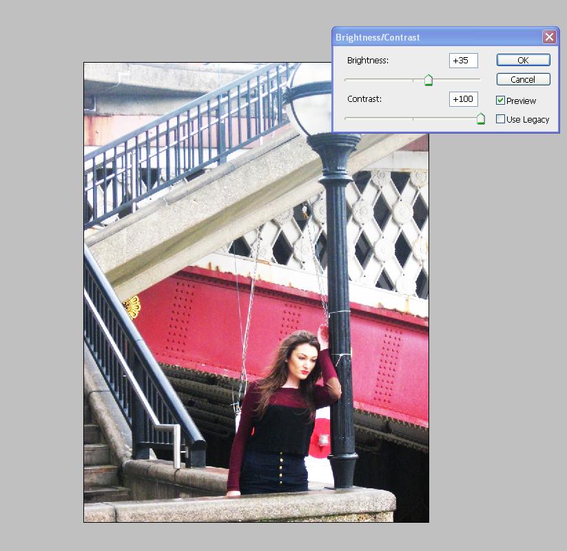
When I took my photos for my article, as I decided to set my scene out side along the river in west london, I couldnt really play with the lighting as it was all natural light and there was no where for me to use lights. So in photo shot I edited most of my pictures to make them brighter, or I added in lighting effects.

Thursday, 26 January 2012
New Photos
I decided to go back and take some more photos for my article and a few more for my contents page. The represntation of her character wasnt right in the draft, as I wanted to show different sides to her, as the article is all about her moving on from a past relationship. I decided to go to southbank to take photos by the river as there were lots of locations there for me to take images of someone remising as well as images of her being carefree and happy.
For the contents photos I went to a local park, as I wanted it to have a sligtly more urban feel, as my magazine is mainstream so it includes a range of genres. I wanted the artist to look as if they were thinking or having fun, and thats why I chose that location as there were a lot of places for me to take photos, and I also did it at night so I could play with the ligthing.


For the contents photos I went to a local park, as I wanted it to have a sligtly more urban feel, as my magazine is mainstream so it includes a range of genres. I wanted the artist to look as if they were thinking or having fun, and thats why I chose that location as there were a lot of places for me to take photos, and I also did it at night so I could play with the ligthing.


Thursday, 19 January 2012
Final Magazine Cover

Here is the final edited version of my front cover for my music magazine. I decided to change the font on the front cover to match the inside of my contents page. I also re edited the image to emphasise the shadow on the right side of her, this makes her face seem lighter as I also added a slight spot light coming down from the left hand corner.
Wednesday, 11 January 2012
magazine front cover , Second Draft

This is my second draft of my front cover. i changed the image because i felt that this one was stronger and portrayed her better. Also it had a slight shadow and i didnt need to remove the background as it has a slight shadow and i thought it just looked more proffesional in general. Also i changed my title block as before it seem too edited and this one is mopre simple, yet still stands out on the page.
Subscribe to:
Comments (Atom)